Heritage meeting modern elegance!

Branding
Visual Identity
August 2026
Dumitrescu & Negrea is a Bucharest-based law firm covering corporate, civil, and commercial law. When two experienced lawyers decided to join forces under one name, they needed a brand identity to match: modern, clean, and unmistakably premium. Something that says high-end law firm from the first glance.
The challenge was clear but not easy. How do you create a logo and visual identity that checks all the boxes: premium, minimal, high-end, without falling into the usual clichés? No generic scales of justice, no overused pillars. The identity needed to feel like it belongs to a top-tier international firm, not just another local practice.
The project started with a brand workshop designed to understand not just what the firm does, but how it thinks. Through conversations with the founding partners, a few key themes emerged: they wanted to feel prestigious but approachable, serious but not intimidating.
These conversations shaped four guiding principles that informed every design decision moving forward: Approachability. Partnership. Premium. Authority.
The creative process went through several directions. Three initial concepts were developed, each exploring a different angle. All three were well received for being clean and modern, but none of them quite hit the premium feel the firm was going for. One direction included a shield element, but the partners felt it leaned too much into cliché territory.
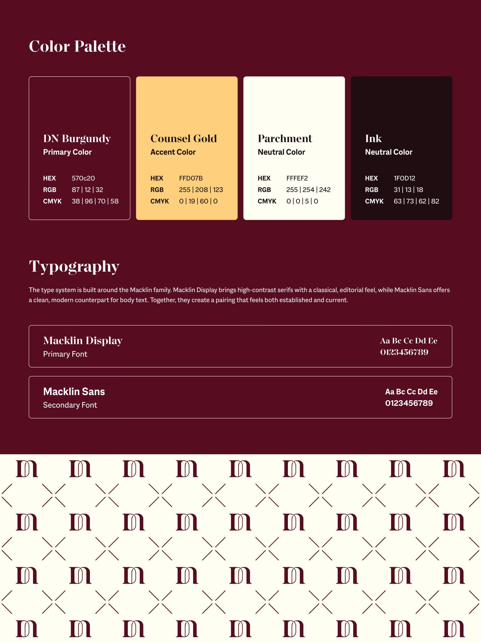
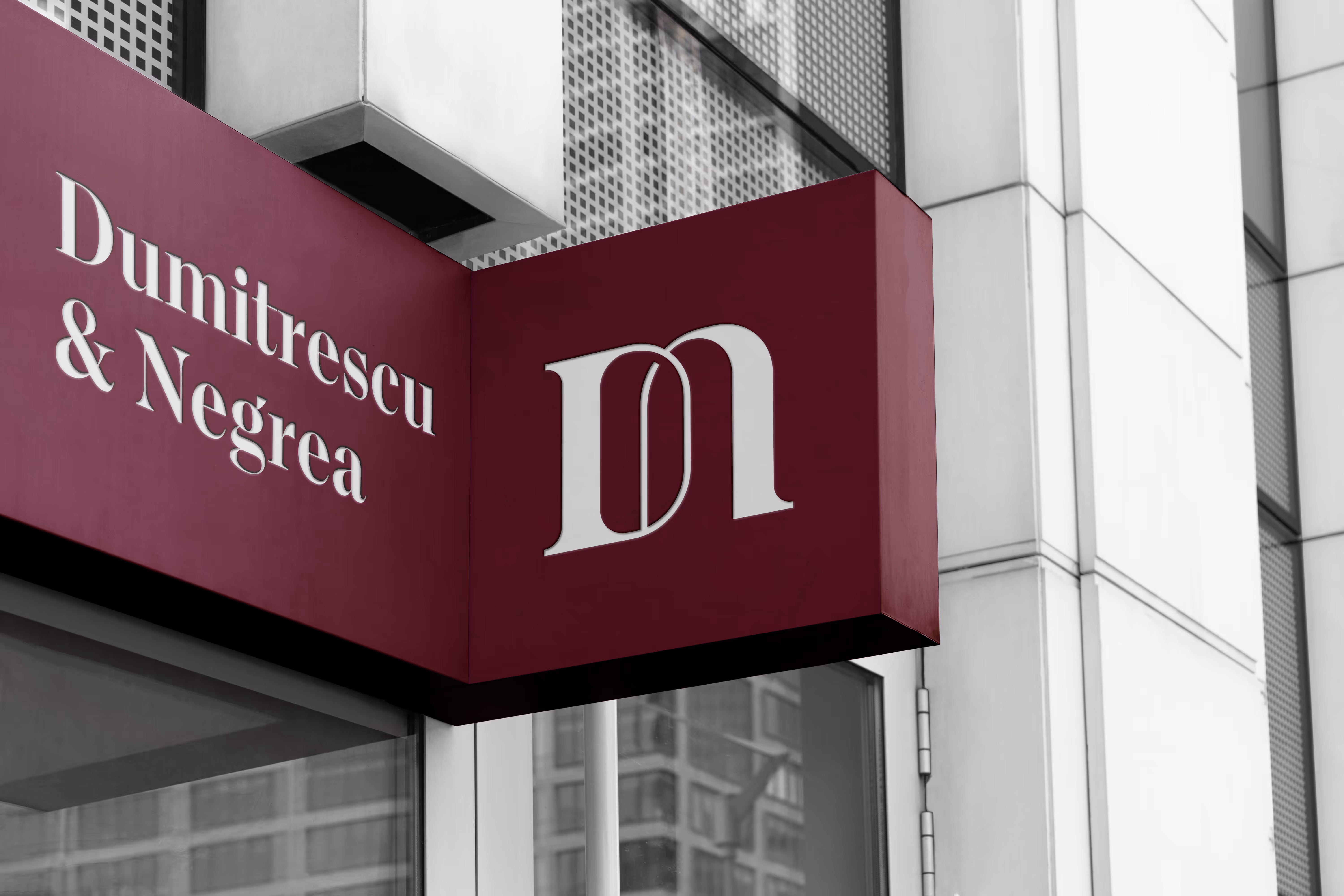
The winning concept came with the fourth version: a custom monogram where the D and N interlock into a single letterform. The mark wasn't based on any existing font. It was built from scratch using geometric shapes, giving it a unique and ownable character.


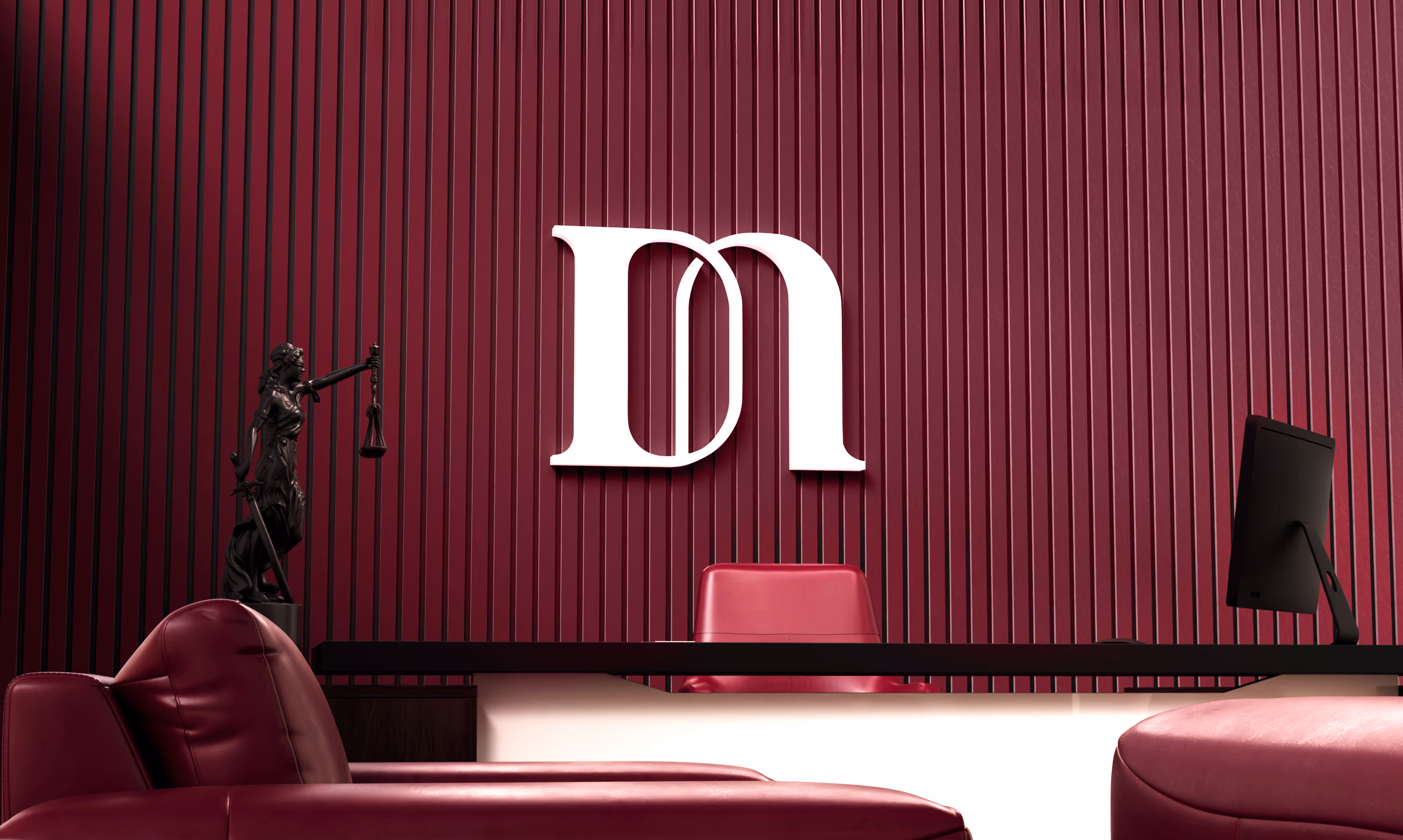
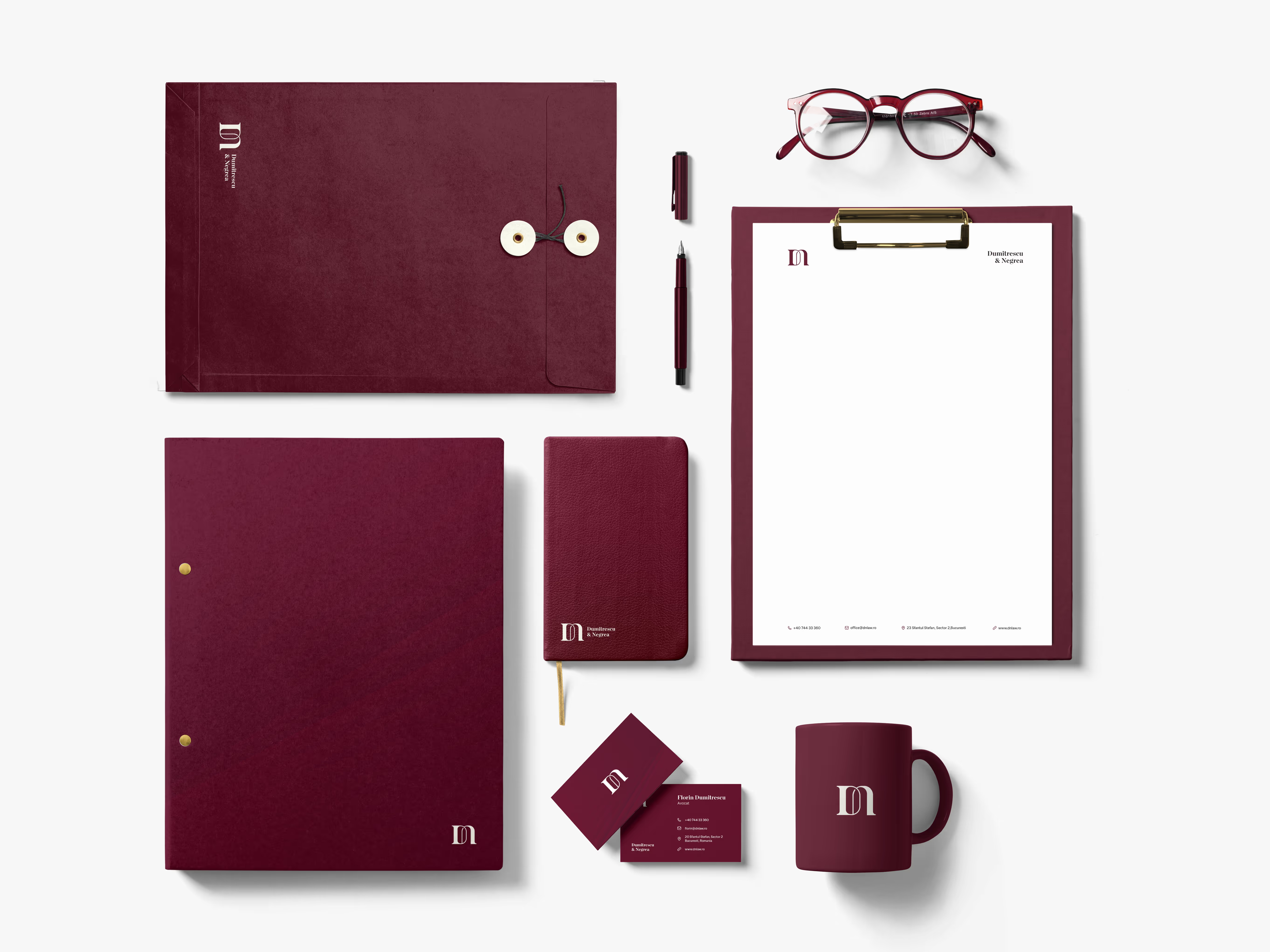
The final mark brings together a D and N into one fluid, interlocking symbol. The serif style carries a sense of tradition and legal weight, while the way the two letters merge speaks directly to the idea of partnership. Two individuals, one practice, one identity.
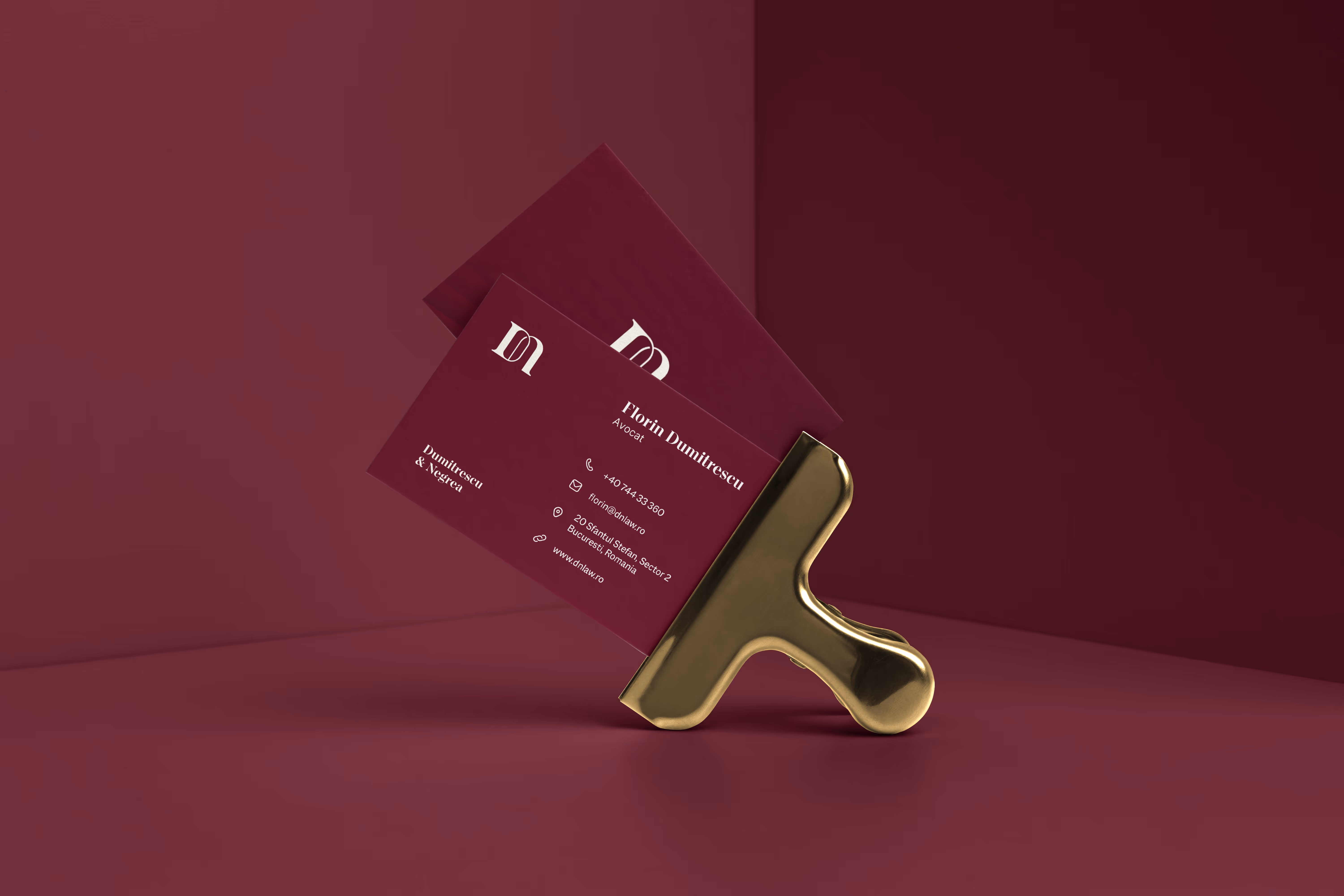
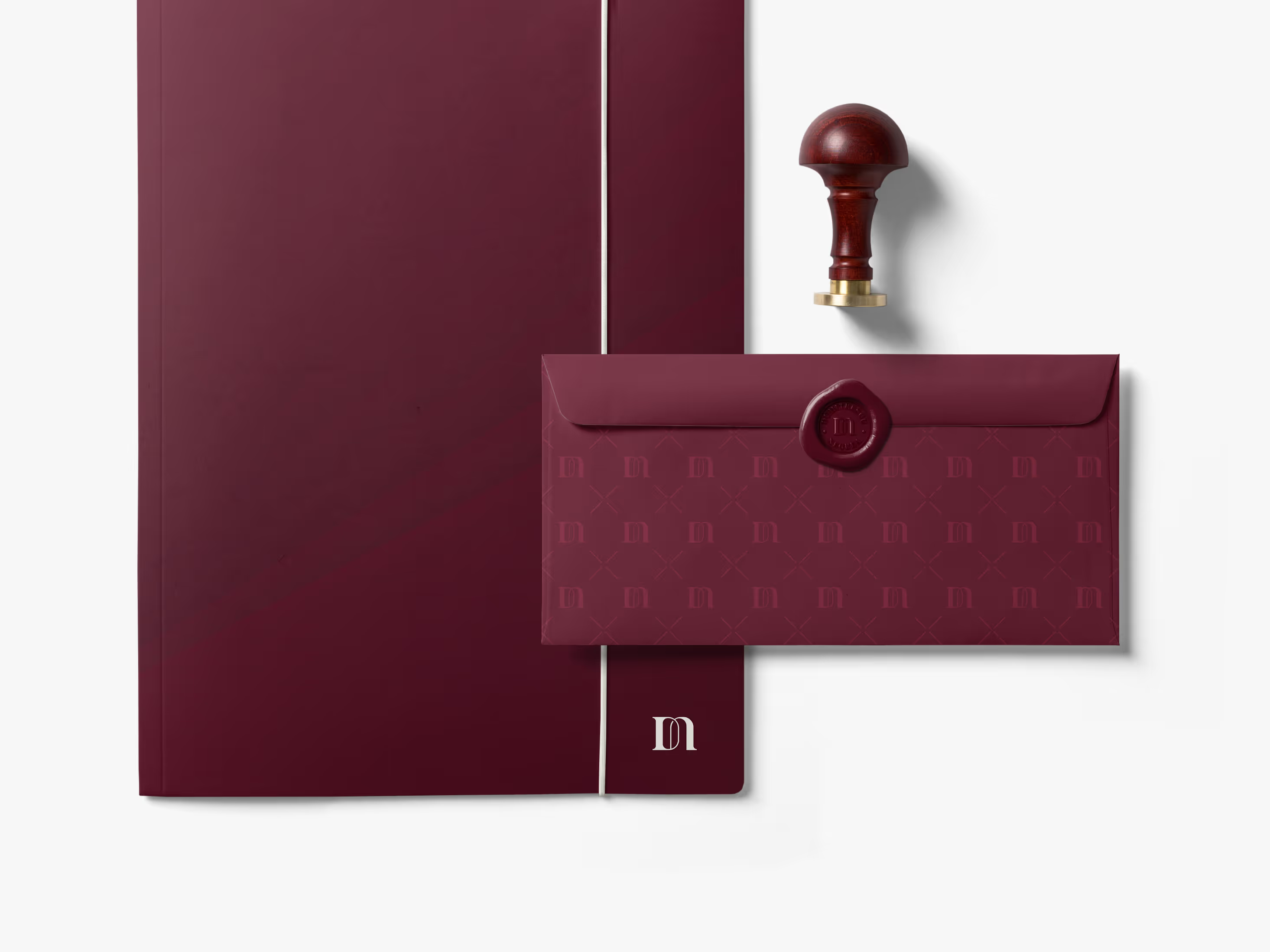
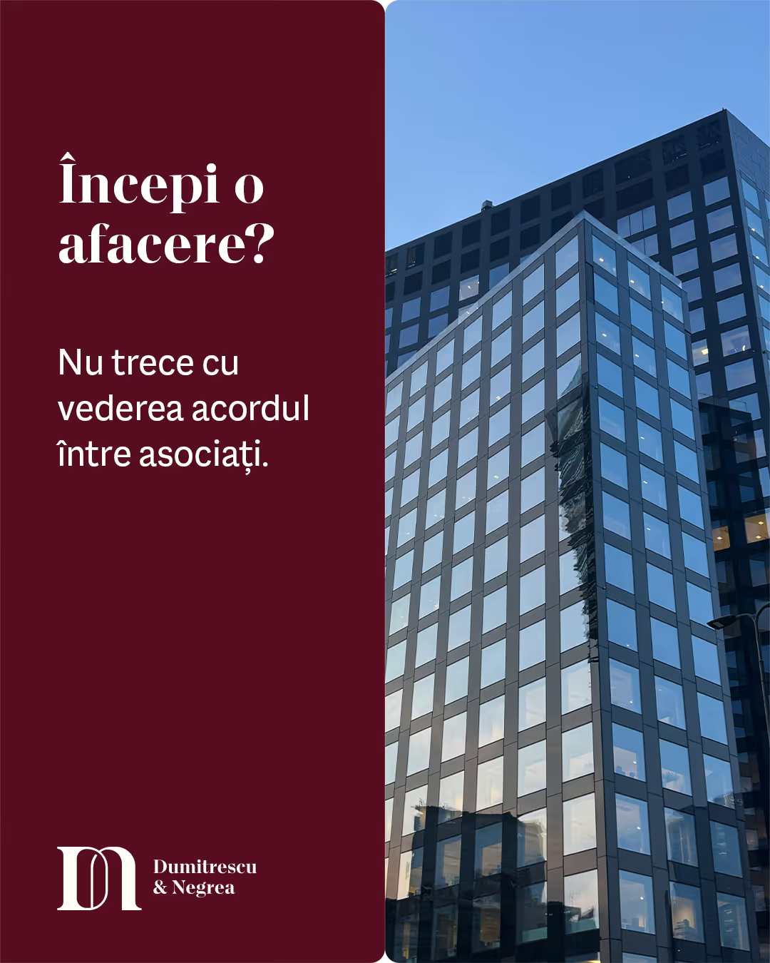
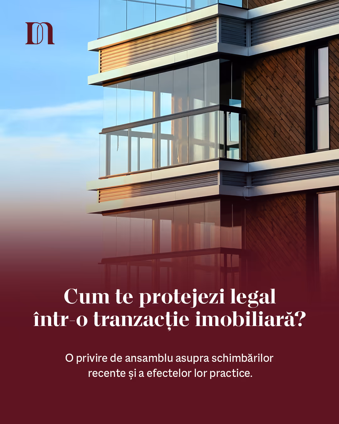
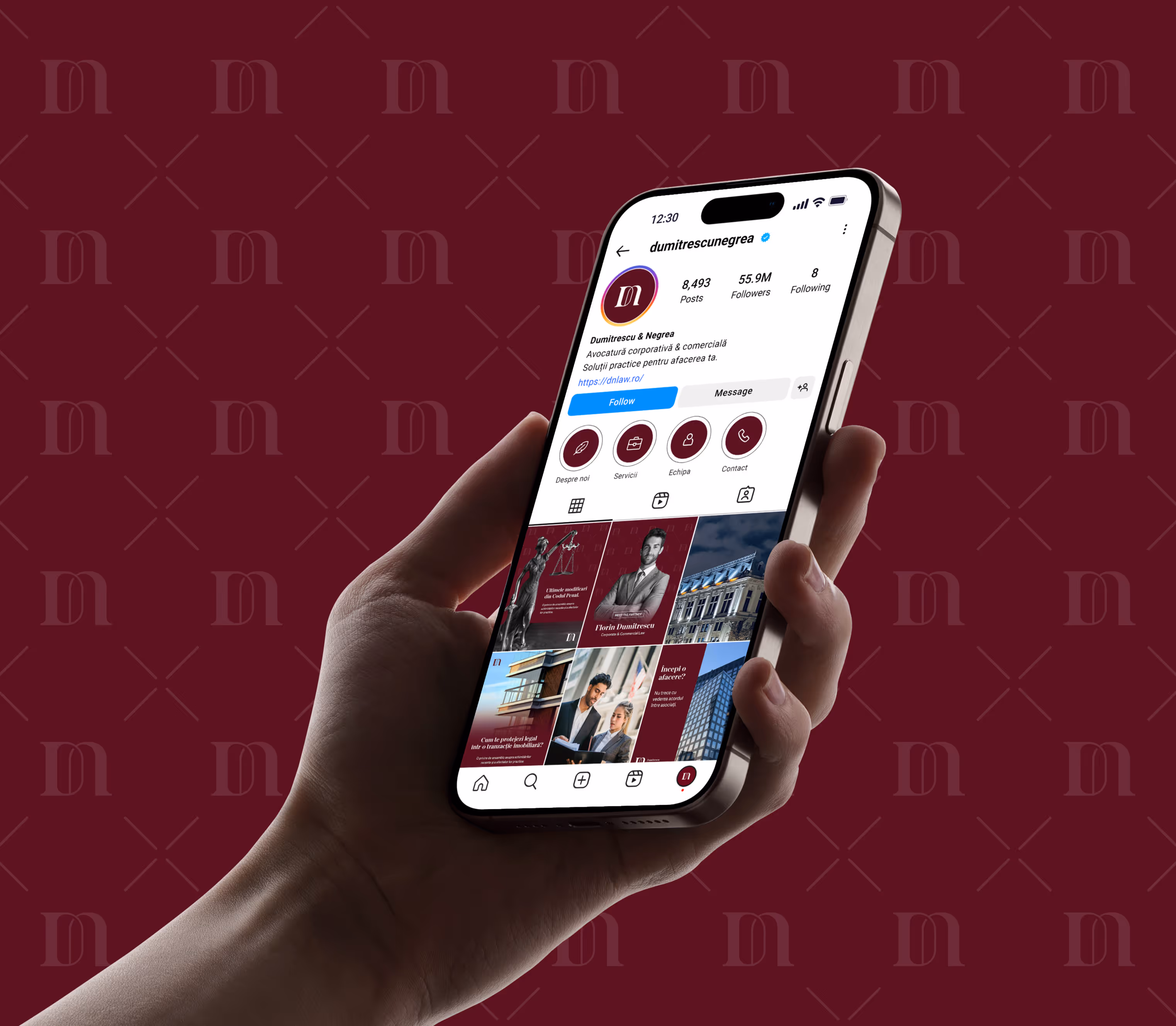
Every touchpoint was designed to work as part of one cohesive system. From letterhead to business cards, each piece reinforces the same visual language: clean, confident, premium.


%201.svg)

%201.svg)